Introduction
Data science and Machine learning have become necessary in various fields. Everyone does not have time and is not capable of writing the code. Orange is a solution that comes with a user-friendly, open-source tool, designed for interactive data analysis and visualization
The drag-and-drop interface makes it easy for anyone to explore a dataset, build a machine-learning model, and visualize it without any programming knowledge. This makes it an ideal tool for those new to data science and for professionals who want to quickly generate insights from their data. Orange’s friendly interface and features enable users to explore data and create stunning visualizations with just a few clicks. A student, a researcher, a professional, anyone can seamlessly work with data.
We’ll take you step by step from installing and getting started with Orange.
By the end of this blog, you’ll have a solid understanding of how Orange can help you unlock the potential of your data, making data science more accessible and efficient than ever before.
Installations and Setup
Step 1: Download Installer
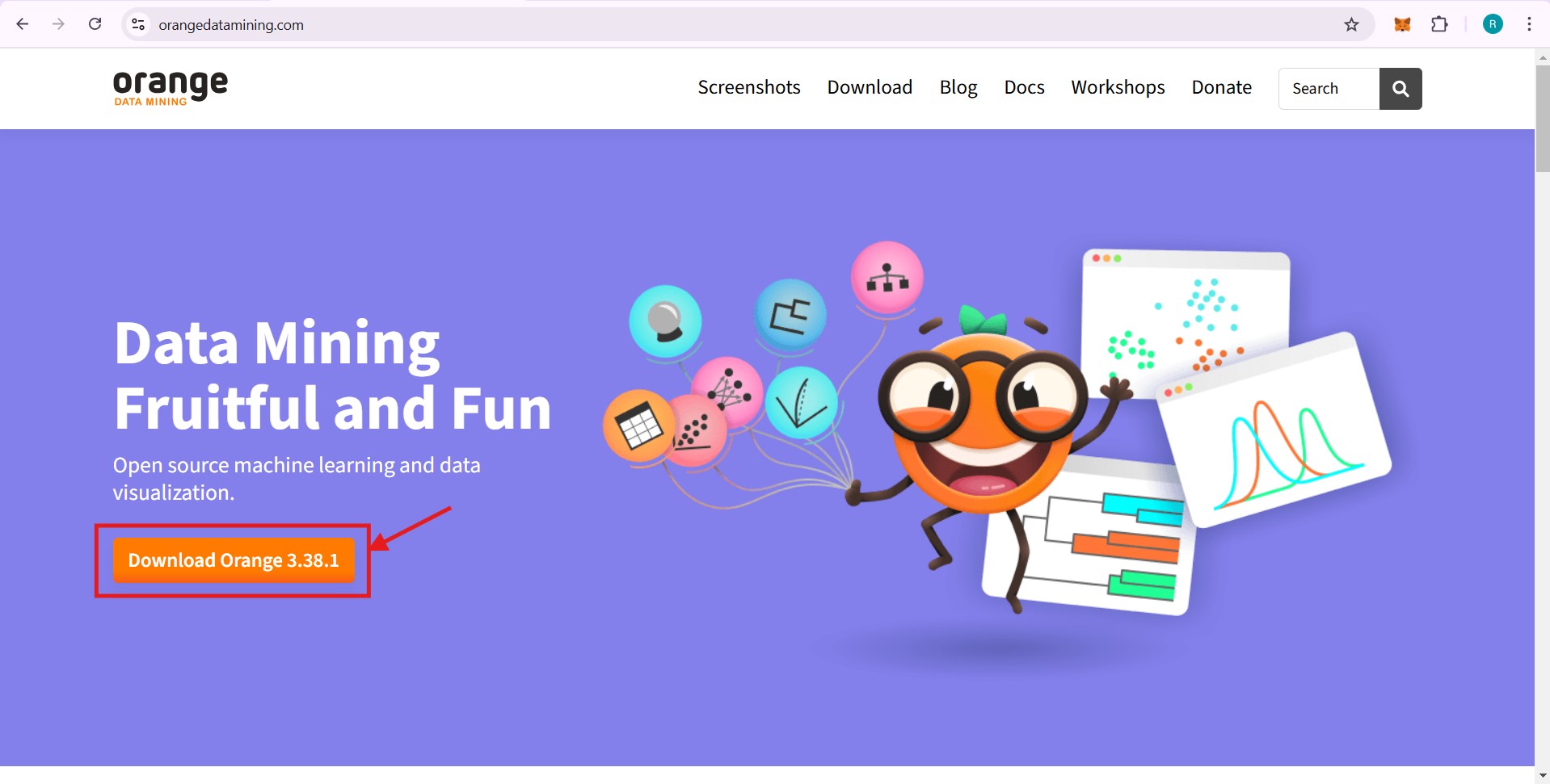
Download the installer package from the official website.
Step 2: Install According to Your OS
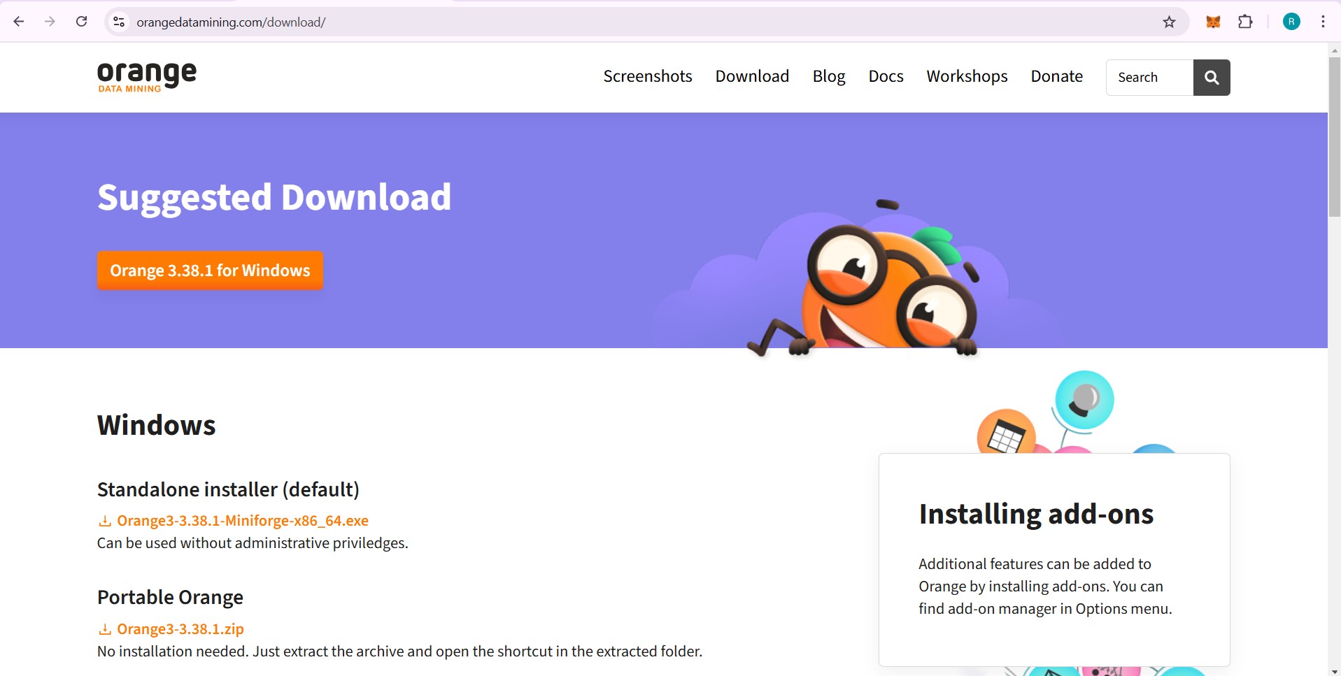
Download the installer package that is compatible with your operating system.
Step 3: Welcome to Setup
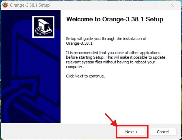
Click “Next” to proceed.
Step 4: License Agreement
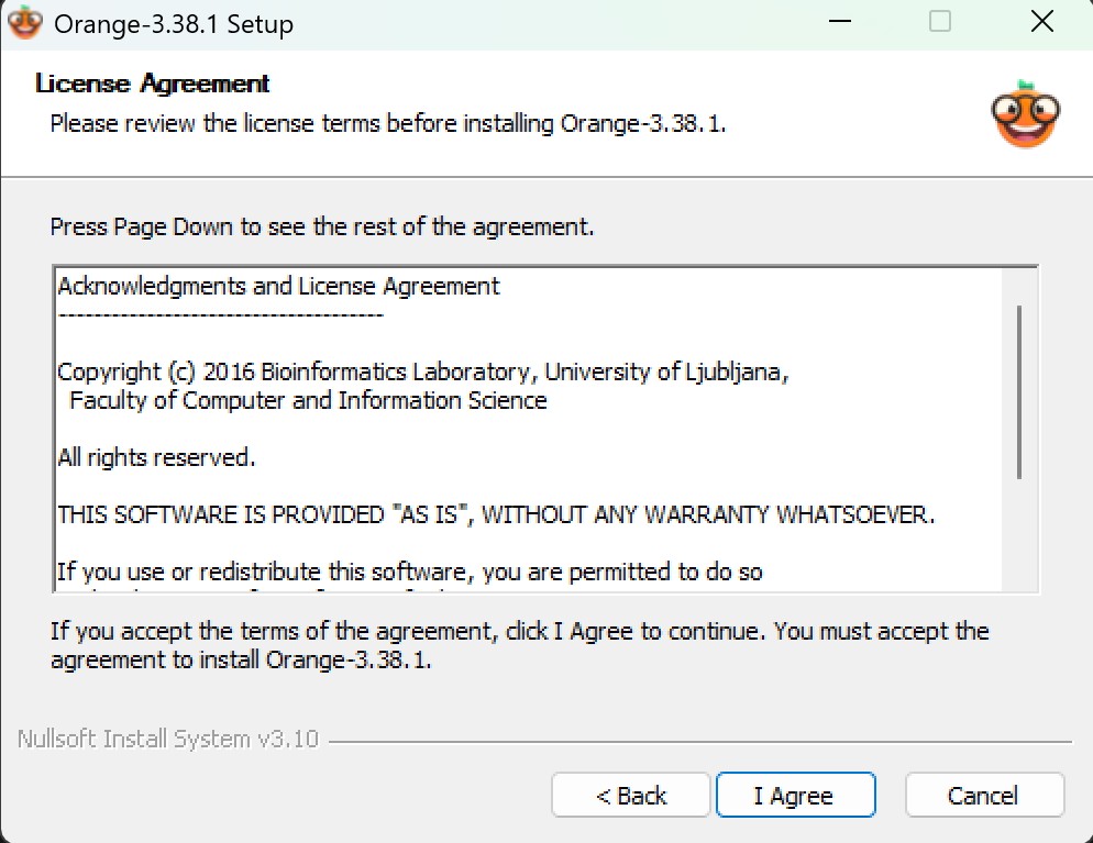
Click “Agree” to accept the license terms.
Step 5: Choose Installation Location
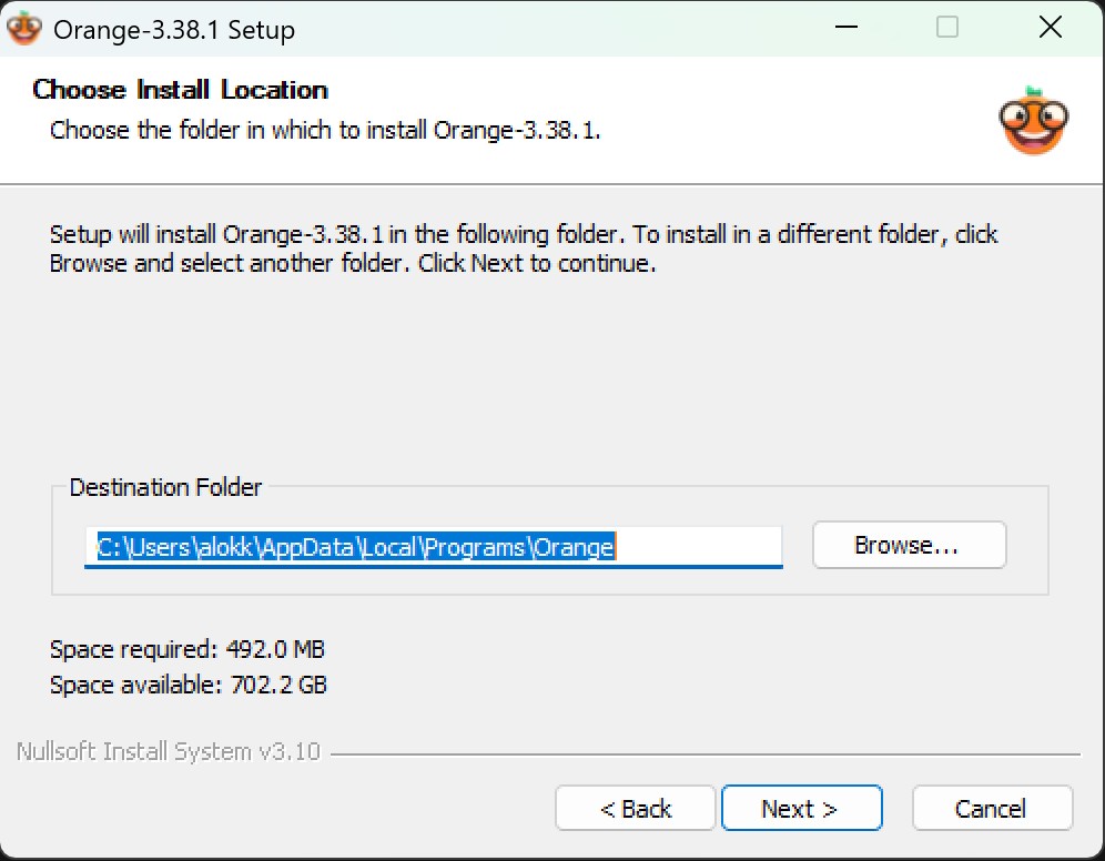
Select your desired installation location and click “Next”.
Step 6: Installed
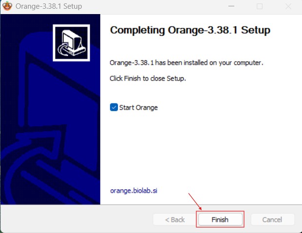
Click “Finish” to complete the installation.
Key Features & Explanation
Orange is a powerful and user-friendly tool to visualize data without writing any code. Its drag-and-drop feature makes it easy to use for beginners, and its different features make it very useful. There are different widgets that we can use. Here are some of the key features that make Orange a valuable tool for data analysis, machine learning models, etc.
1. Drag-and-Drop Workflow
One of Orange’s biggest strengths is its visual programming interface. Instead of writing code, users can build complex workflows by simply dragging and connecting widgets, making data visualization faster and easier.
2. Interactive Data Visualization
There are various types of visualization tools that Orange provides. Some of them are:
- Scatter plots
- Box plots
- Histograms
- Heatmaps
- Bar plots
These visualizations help users understand patterns, trends, and relationships in their data.
3. Built-in Machine Learning Tools
Orange comes with pre-built machine learning widgets that allow users to apply algorithms such as:
- Regression (Linear Regression, Random Forest, Neural Networks)
- Clustering (K-Means, Hierarchical Clustering)
All these are done without writing any code, allowing users to compare models on different training and testing datasets and evaluate model performance.
4. Data Preprocessing
Orange provides many widgets to filter and refine data, making it more convenient for analysis. Orange offers a wide range of data processing tools, including:
- Filtering missing values
- Feature selection
- Data transformation
These tools help users clean their datasets and improve the accuracy of their models.
Screenshots
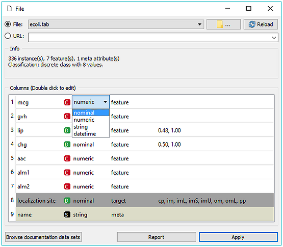
- Load and edit your data in the File widget.
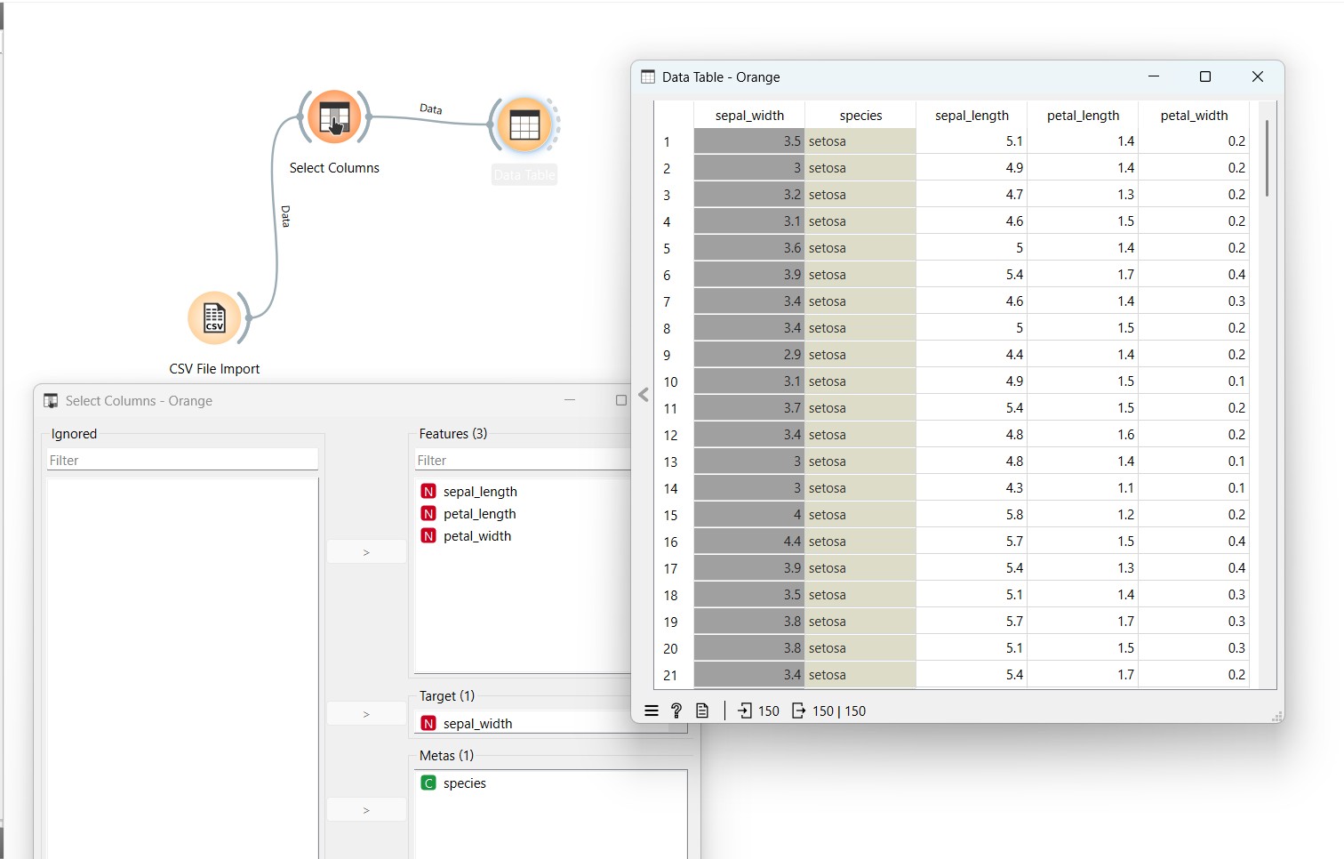
- Select columns and make it target or ignore columns
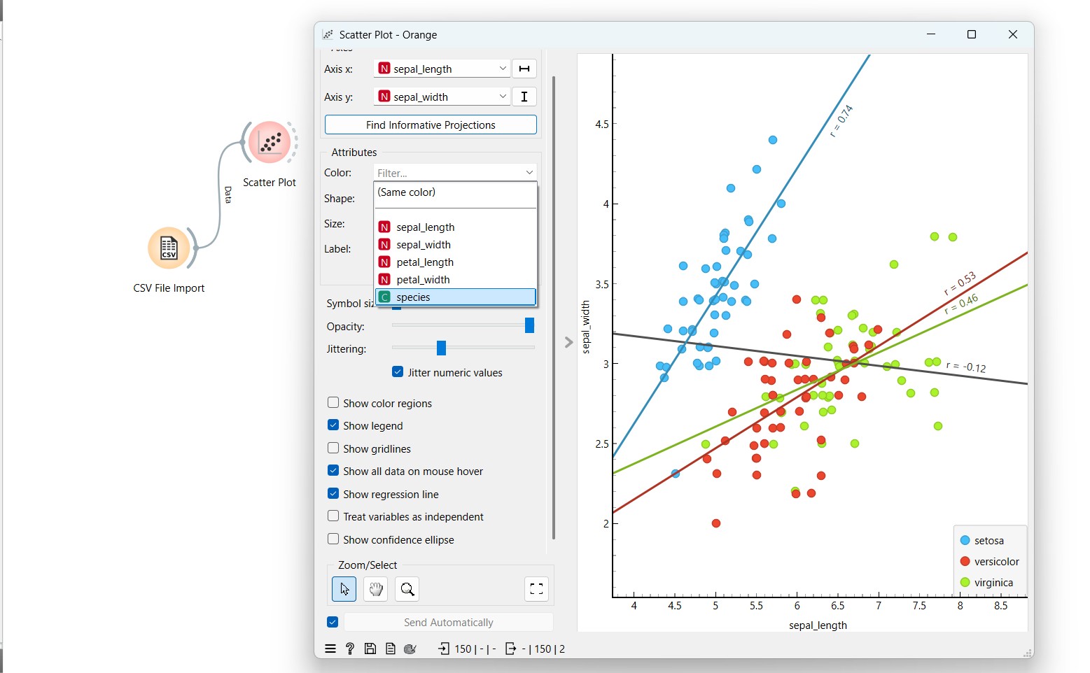
- ploring Various Features in Scatter Plots: Regression Line, Axis Selection, and Color Encoding
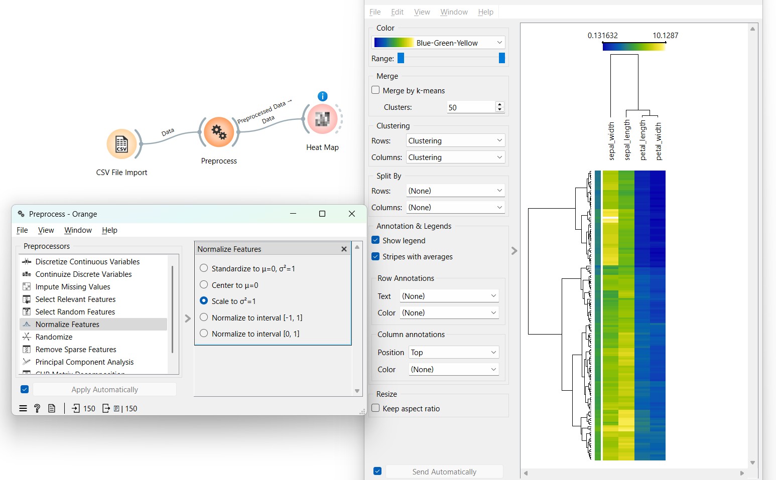
- Heatmap visualisation
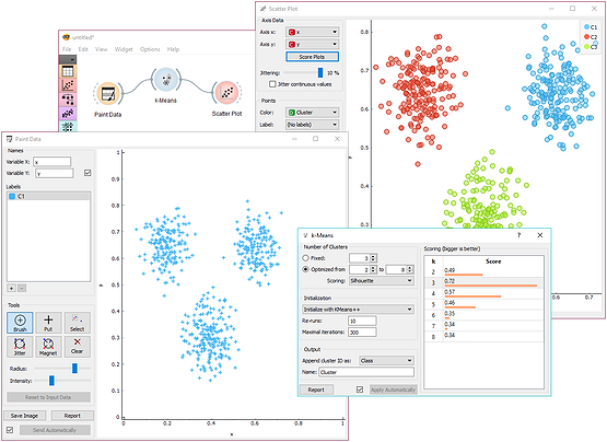
- Playing with Paint Data and an automatic selection of clusters in k-Means
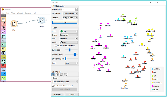
- Multidimensional scaling of Zoo data set reveals phylogeny groups
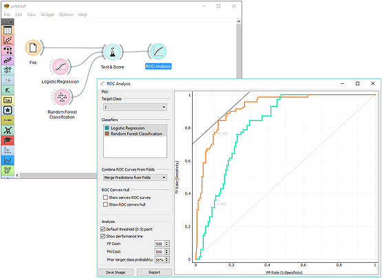
- Receiver operating characteristics (ROC) analysis
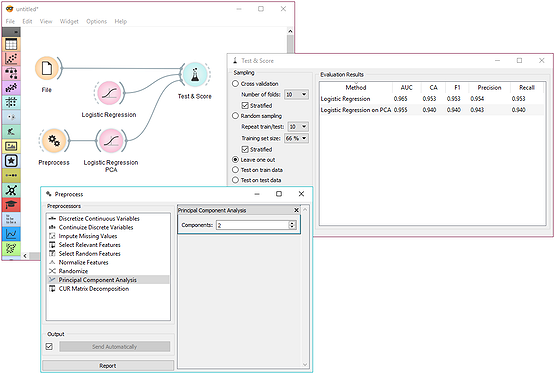
- Data preprocessing embedded within a learning algorithm
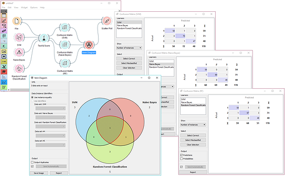
- Finding common misclassifications of three predictive models
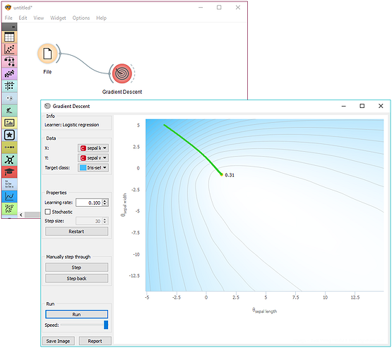
- Interactive gradient descent
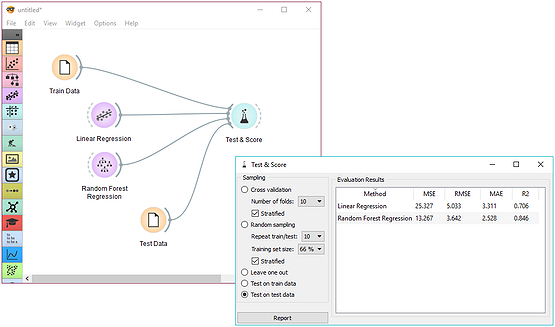
- Model testing and scoring on a separate test data set
Use Cases
Orange is a versatile tool that can be applied in various fields, making data science more accessible and efficient. Here are some key areas where Orange proves to be highly beneficial:
1. Education
Orange is widely used in classrooms and workshops to teach data science and machine learning concepts without requiring programming skills.
Its drag-and-drop interface makes it easy for students to experiment with data.
2. Research
Researchers across different fields use Orange to analyze datasets, visualize patterns, and apply machine learning models for scientific studies.
It simplifies data processing and speeds up hypothesis testing.
3. Business Analytics
Companies use Orange to explore customer behavior, identify trends, and make data-driven decisions.
With machine learning capabilities, businesses can improve sales forecasting and market analysis.
4. Healthcare & Bioinformatics
Orange helps in medical research by analyzing patient records, genomic data, and disease prediction models.
Its bioinformatics add-ons make it an excellent tool for studying biological data.
Conclusion
Orange is a powerful yet easy-to-use tool that makes data analysis, visualization, and machine learning accessible to everyone. Its interactive drag-and-drop interface, built-in machine learning tools, and real-time data processing capabilities make it a valuable resource for students, researchers, and professionals alike.
Whether you are an educator looking to teach data science, a researcher analyzing complex datasets, or a business professional seeking insights, Orange offers a simple yet effective way to explore and interpret data. Give it a try and start your journey into data science today! 🚀
References & Further Reading
Orange3 is a powerful open-source data visualization and machine learning tool. Below are the key resources to help you learn and explore Orange3 in depth.
Official Resources
- Official Website
- Overview of Orange3 features
- Download and installation guides
- Official Documentation
- Tutorials and References
- Widget descriptions and workflows
- Orange3 GitHub Repository
- Source code and development updates
- Contribution guidelines
- YouTube Playlist: Orange3 Tutorials
- Beginner to advanced video tutorials
- Orange3 Forum
- Ask questions and share ideas